Creating and using custom keypads
You can either create a new keypad or customize an existing one.
Creating a keypad
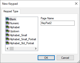
- In ProjectView, right-click Keypads and select Insert Keypad: the New Keypad dialog is displayed.
- Select one of the available keypads, or Blank to create a keypad from scratch. In this case a blank keypad is displayed.
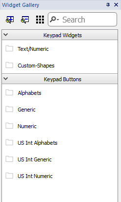
- Use the Keypad Widgets and Keypad Buttons from the Widget Gallery to create your custom keypad.

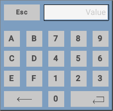
The keypad you create, as in this example, will be saved in the project folder.
Text/Numeric Controls
The Text/Numeric folder contains some specific controls to keypad development.
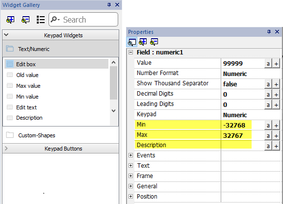
| Data source | Description |
|---|---|
| Edit box | New value |
| Old value | Current value |
| Min value | Min value defined inside the field's property currently editing. |
| Max value | Max value defined inside the field's property currently editing. |
| Edit text | Simple text label |
| Description | Description defined inside the field's property currently editing. |
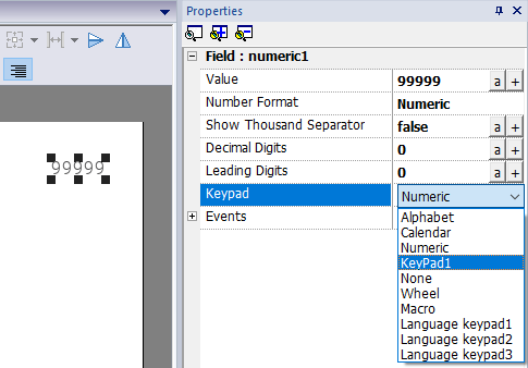
Attaching custom keypads to fields
Custom keypads can then be reused for any field where the Keypad property points to it as in this example.
Tips and tricks with custom keypads
By default, any numeric widget (read/write numeric field) are assigned the numeric keypad.
If you want to apply a customized version of the numeric keypad to all the numeric widgets you add to your project proceed as follows:
- Create a new keypad and select Numeric as Keypad type. This will be a backup of the original settings for the numeric keypad.
- Customize the default numeric keypad and save it. This customized version of the numeric keypad will now be assigned as default in the project.
See "Deleting or renaming custom keypads" for details on how to rename a custom keypad.
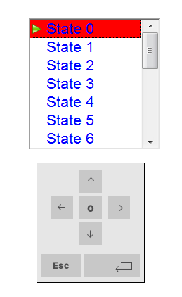
Up-down arrows keypad
This type of keypad is particularly useful to move the cursor up and down within widget requiring this functionality. Here an example using a Control List widget. See "Control list widget" for details.